Blog Category(283 Blogs)
 Python
 Magento
 Odoo
Odoo How To
 How Much
 Yii Development
 Core PHP
 Prestashop
 Latest News
 Education
 Web Design
 Business
 Ecommerce
 Travel
 Banking and Finance
 Web Development
 Ruby On Rails
 Joomla Development
 Ecommerce
 Magento Development Services
 Hire a Developer
 Web Crawling Services
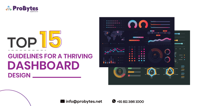
Top 15 Guidelines for a Thriving Dashboard Design
The dashboard is designed to offer a comprehensive visual display of status and real-time performance updates. A thriving dashboard design will be functional, purposeful, and relevant. It needs to be regularly updated so that the users will be able to view the latest information at any point in time or any state of the work process.

The dashboard design should serve its purpose. If it is designed for the operations team, then it should have all the relevant project details and updates, status of work completed by all the people involved in the project. In case, the dashboard is created by business leaders, then it should have all the relevant information that the senior management will need to know about the health, performance, and issues in the company.
In this blog, we will look into the top 15 guidelines to keep in mind while designing a thriving dashboard design.
1. Do essential research before designing the dashboard
Before you start working on the dashboard design, you need to have all information about the stakeholders, the end-users, budget, timeline, technology constraints, security, and level of interaction. You should also find out the function and purpose of the dashboard and the data that needs to be displayed on the dashboard.
Read Also: Web Development Vs Web Design – Want To Know The Difference?
Before the designing process begins, you should have decided on the key metrics and benchmarks that need to be displayed. You should also know where all the data is being collected, and if the data is cross verified before being presented on the dashboard.
Details such as complete or partial access for different users and technology to be used while building the dashboard should all be finalized before creating the dashboard design.
2. Decide on the type of dashboard
It is essential to have a definite idea of the purpose of the dashboard before it is designed. The major types of dashboards generally used in most applications are operational, tactical, strategic, and analytical.
An operational dashboard is time sensitive and needs to have updated and critical data that will allow users to know the status of any task or resource at any point in time. Analytical dashboard, on the other hand, is more focused on providing pertinent information required for decision making.

This dashboard is not time sensitive, and will feature more tools for analytics. Tactical dashboards are generally designed for upper management. The data in this dashboard will help them get a deeper understanding of the results of the company’s actions. A tactical dashboard will have visual data and trends that will help the stakeholders to make informed decisions.
A strategic dashboard will have key performance indicators, performance metrics, or goals that the senior executives of a company need to reach. The dashboard will help the executives know the status of their projects in terms of the strategic goals at any point in time. Depending on the purpose and audience, you need to decide on the type of dashboard.
3. Have only essential components in the dashboard
It can be tempting to put in a lot of components in a dashboard, but that will completely defeat the purpose of creating it in the first place. So, depending on the type and purpose of the dashboard, you need to add only the key components.
The dashboard can have essential data of the project or the process, visualized forms of the data like tables, charts, and graphs, and links for those who want to check the data in-depth.
4. Have a responsive dashboard design
A dashboard that has too many data visualization elements can become overwhelming and confusing for the user. So, instead of spending a lot of time deciding which elements you want to have on the dashboard, you can hand over the control to the user.
You can create an interface that allows the user to see the key data in the main window and drill-down data in the sidebar or pop-up windows. A dashboard with responsive design allows the user to decide what information he/she wants in the main window and what data in the sides.
5. Offer different views of the dashboard
Offer different display views that the user can select based on his/her preferences. An online bank account can have different views – a view that allows the user to check the account balance, deposits, payments, and more or a view that gives them the account summary and the latest transactions.
Similarly, the dashboard of an online restaurant booking application can show a view of the current reservations, upcoming reservations, payments made, and such or a view that allows the admin to filter details by date or view employee shifts and vendor details.
6. Design the dashboard based on the audience
In general, a hierarchy is followed in all companies. The hierarchy not only determines the roles and responsibilities, but also the extent of data that they can access.

You should create a pyramidal structure based on the management structure. It will allow you to design the dashboard layout based on the specific audience.
7. Choose the right forms of data visuals
Data visualization is one of the key components of a dashboard, especially while displaying multiple types and forms of data. Whether you have a static or a dynamic dashboard, it is important to choose the right kinds of graphs and charts to visually display the data. Here are some suggestions for using the right kind of data visualization elements:
- While comparing data, line and column graphs are best. Also, while creating these graphs, make sure that the data is sorted from highest to lowest or lowest to highest and not in some random order
- Preferably, line graphs should not have more than 5 values and bar graphs not more than 7 values
- If you have a graph that shows the change of a value over time, you should always plot time along the horizontal axis, in increasing order
- For correlation and distribution analysis, use scatter plots
- To show connections between data points, use a network diagram
- Though pie charts and donut charts look very pretty on the screen, they may not be useful as understanding the data they represent is very difficult. So, preferably avoid these types of charts
8. Be consistent in naming conventions and date formatting
The naming convention that you use in the dashboard should be consistent with what is being used in the process or the project. If you are labelling data using a particular format in the process, then the same should be followed in the dashboard.

The same rule works for date formatting. Whether you use dd/mm/yy or mm/dd/yy, be consistent with the format on the dashboard.
9. Focus on the layout and flow
While designing the layout of the dashboard, pay attention to the alignment and flow. You need to first create a grid or a basic skeleton that will have the details of the components of the dashboard. The layout should be designed in such a manner that the user can smoothly “read” the data and the interpretation.
10. Make optimum use of white space
Negative space or white space is an essential component of the dashboard design. A balanced white space makes it easy for the user to navigate the dashboard and read the data.
Read Also: 13 Frequently Asked Questions On Python Web Development
11. Allow for personalization of the dashboard
For the dashboard to be useful, it needs to have the information that the user is looking for. The user should be able to customize the layout, content, and data visualization elements according to their role, preferences, and requirements.
12. Use tables for large data chunks

Tables are a convenient way to display large volumes of data in an organized manner. Moreover, most users will have experience in working with MS Excel. So, they will find it easy to manage and read tables in the dashboard. Also, a table doesn’t take up a lot of the space and allows for extension, if required.
13. Automate data collection
To ensure that the dashboard is always up to date, automate the data collection process. If you collate data using an excel sheet, then you can build the dashboard such that the data from the excel sheet can be directly uploaded to the system. You can also use integrations to directly upload data to the system.
14. Use the design-led development process
The agile development process recommends creating the design first and then moving on to the development process. The initial planning phase should focus more on the design elements of the dashboard.
Once the layout and flow are finalized, the development process can be initiated. This method reduces the time required to build the dashboard. At the same time, it also reduces the unnecessary change in the codes and algorithms if the design needs to be changed.
15. Save Dashboard designing for the last
A dashboard will have a summary view of all the tasks and data from the process. So, it is important to do the dashboard design at the last after the entire website or application has been designed.

This way is more practical as you will have an idea of all the components you should integrate into the dashboard design. If you work on the dashboard first, then you should go back and forth, making changes in the dashboard as you develop your application
Read Also: 7 Web Development Strategies To Take Your Business To The Next Level
Conclusion:
A thriving dashboard design has all the essential visual elements that allow the user to easily read the data. The layout and flow should be smooth so that the user can interpret the data and gain the information that he/she is looking for.
Finally, the design should be simple, minimalistic, and purposeful. Probytes can design a unique and functional dashboard for your application or work process. Contact us to know more